Psychological Cycles: The Emotional Rollercoaster of Trading
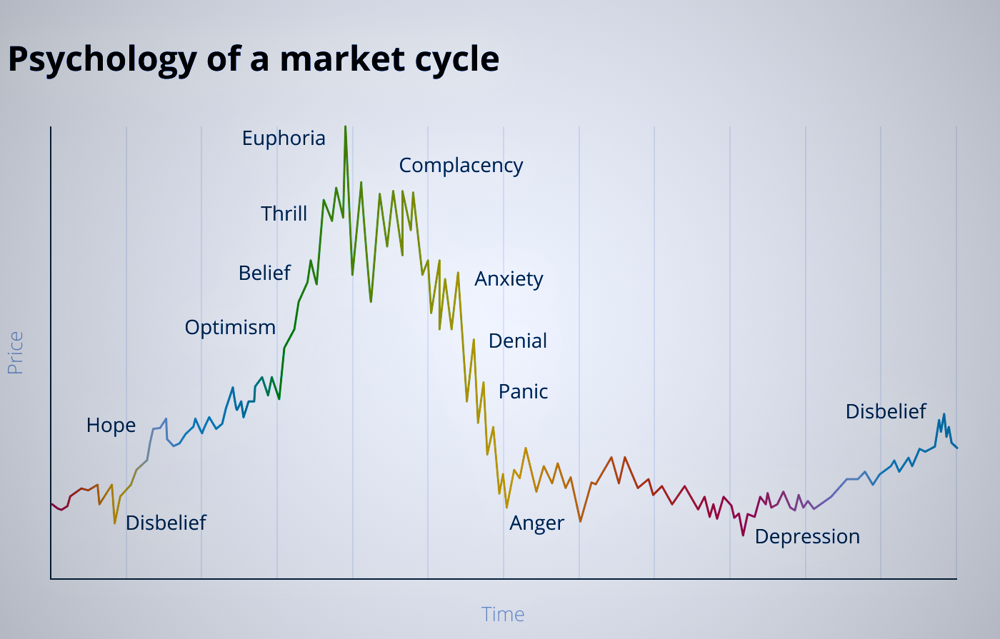
When diving into trading, one of the most overlooked yet crucial aspects is understanding psychological cycles. The market isn’t just driven by numbers and data—it’s also shaped by the emotions of investors. Emotional behavior can significantly affect the market, as illustrated in the classic chart “Psychology of a Market Cycle.” This cycle provides a more detailed understanding of investors’ sentiments than the straightforward bull/bear concept.
Spend a couple of minutes looking at the chart. Save it. Print it somewhere and occasionally look at it. You will go through all of these emotions multiple times.
Take a mental note each time you pass the cycle.
Learn from it.
This will be a never-ending process of self-improvement.
It will not only benefit you as a trader/investor but as a person as well.
Market Psycology Graph

Now let’s break down the typical emotional phases of a market cycle so we know what we’re up against:
-
Disbelief
The cycle often begins after a period of loss or stagnation. Investors and traders don’t trust the market’s recovery and a re skeptical of any upward movement. During this phase, few believe the market will improve significantly.
-
Hope
As the market begins to show genuine signs of improvement, some investors and traders start seeing opportunities to make money. There’s a cautious optimism that things might be turning around.
-
Optimism
With continued improvement, optimism becomes the dominant emotion. Investors and traders start to feel more confident and begin to invest more actively, convinced that the market will continue to grow.
-
Belief
This stage sees investors and traders gaining confidence in the market’s sustained growth. They hold onto their investments longer, believing that the market is stable and that gains are almost assured.
-
Thrill
Thrill kicks in as the market grows at a rapid pace. Investors and traders are excited by their gains and increase their investments, driven by a sense of almost guaranteed profit.
-
Complacency
In the complacency phase, investors and traders start assuming that the market will keep rising indefinitely, without much effort on their part. This is when people often relax their caution, expecting easy profits.
-
Euphoria (FIRST DANGEROUS PHASE)
Euphoria is the peak of emotional optimism. Overconfidence takes over, and many make risky investments, expecting nothing but success. This is typically one of the most dangerous phases, as rational decision-making is often replaced by extreme optimism.
-
Anxiety
The market begins to falter, and anxiety sets in. Investors and traders start doubting their choices, wondering if they made a mistake. There is an increasing sense of uncertainty.
-
Denial (SECOND DANGEROUS PHASE)
Some optimistic investors ignore the warning signs. They hold onto their investments, unwilling to believe that the market could be declining.
-
Panic
Fear hits as prices continue to drop, and investors and traders rush to sell their assets to avoid further losses. This leads to a sharp drop in prices, and the market enters a downturn.
-
Anger
Anger follows the panic. Investors and traders are upset about their losses and often look for someone or something to blame—whether it’s the market, bad advice, or even themselves.
-
Depression
In this phase, many investors and traders lose interest and motivation to trade. Their emotional energy is drained, and they become hesitant to engage with the market, even if opportunities start to arise.
-
Disbelief
Finally, the market starts to recover. However, after the experiences of loss and frustration, investors and traders remain doubtful and unwilling to trust the upward trend. It’s a cycle that can easily repeat itself if the underlying emotional behaviors are not recognized.
As mentioned above, the most dangerous phases are Euphoria and Denial. The ability to understand that you are in either of these phases will be the most efficient tool in your Risk Management Kit.
Understanding and Managing Emotional Cycles
Understanding these phases is essential for every trader. If you can recognize which emotional stage the market is in, you can make more informed decisions and avoid falling into the trap of irrational, emotion-driven trading. Keeping emotions in check, having a clear plan, and sticking to your analysis can help you navigate these psychological waves effectively.
Trading isn’t just about numbers—it’s about understanding people, including yourself. By mastering the psychological cycles, you can better anticipate shifts and make more calculated decisions, even when others are caught in the rollercoaster of market emotions.
Support and Resistance
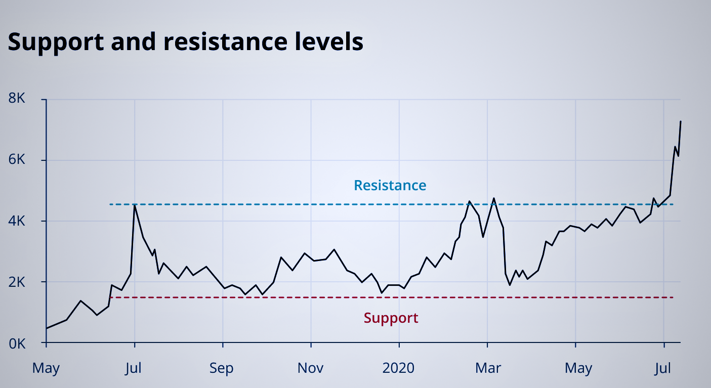
In addition to understanding psychological cycles, a fundamental concept in trading is the use of support and resistance. These two widely used technical analysis (TA) indicators relate to price barriers that tend to form in the market, preventing price action from going too far in a particular direction. Let’s break these concepts down in simple terms.
-
Support
Support can be thought of as a price level or “floor” at which an asset tends to stop falling because buyers come in and start buying significantly, which keeps the price from dropping further. For instance, if a stock’s price drops to $100 and then stops falling because many traders start buying at that price, $100 is the support level. It’s like the price hits a floor and bounces back up.
Support levels are important because they indicate a price where buyers are likely to be more interested, which can help you determine good entry points for a trade.
-
Resistance
Resistance works in the opposite way. It represents a price level or “ceiling” where the asset tends to stop rising because sellers come in and sell heavily, preventing the price from going up further. For example, if a stock’s price rises to $120 and then stops climbing because many traders start selling at that price, $120 is the resistance level. It’s like the price hits a ceiling and bounces back down.
Resistance levels indicate where selling pressure is strong, which can help you identify when it might be a good time to exit a trade.

Traders use support and resistance levels to make decisions about the direction of the price. Once traders identify the “floor” (support) and “ceiling” (resistance), this provides a zone of activity where they can enter or exit positions strategically.
For example, if the price of a stock is fluctuating between $100 (support) and $120 (resistance), traders might choose to buy near $100 and sell near $120, taking advantage of the predictable movement within that range.
Breaking Through Support or Resistance
If the price surpasses these barriers in either direction, it indicates a significant change in market sentiment. For instance, if the price breaks through the resistance level and keeps climbing, it suggests that buyers are stronger and are pushing the market higher. Conversely, if the price breaks below the support level, it suggests that sellers are in control and pushing the market lower.
Once a support or resistance level is broken, it often becomes the opposite. For example, if the price breaks through a resistance level, that level might become the new support level as the market continues to climb.
Support and resistance levels are powerful tools in a trader’s toolkit. By understanding where these price barriers lie, you can make more informed decisions about when to buy or sell. Recognizing these levels allows traders to predict potential price movements and adapt accordingly, making the most of opportunities while managing risk effectively.
Trendlines
Another key concept in trading is the use of trendlines. Trendlines are drawn to represent a sequence of support or resistance levels, which can help indicate a more significant trend in the market. Let’s understand how trendlines work and why they are so important for traders.
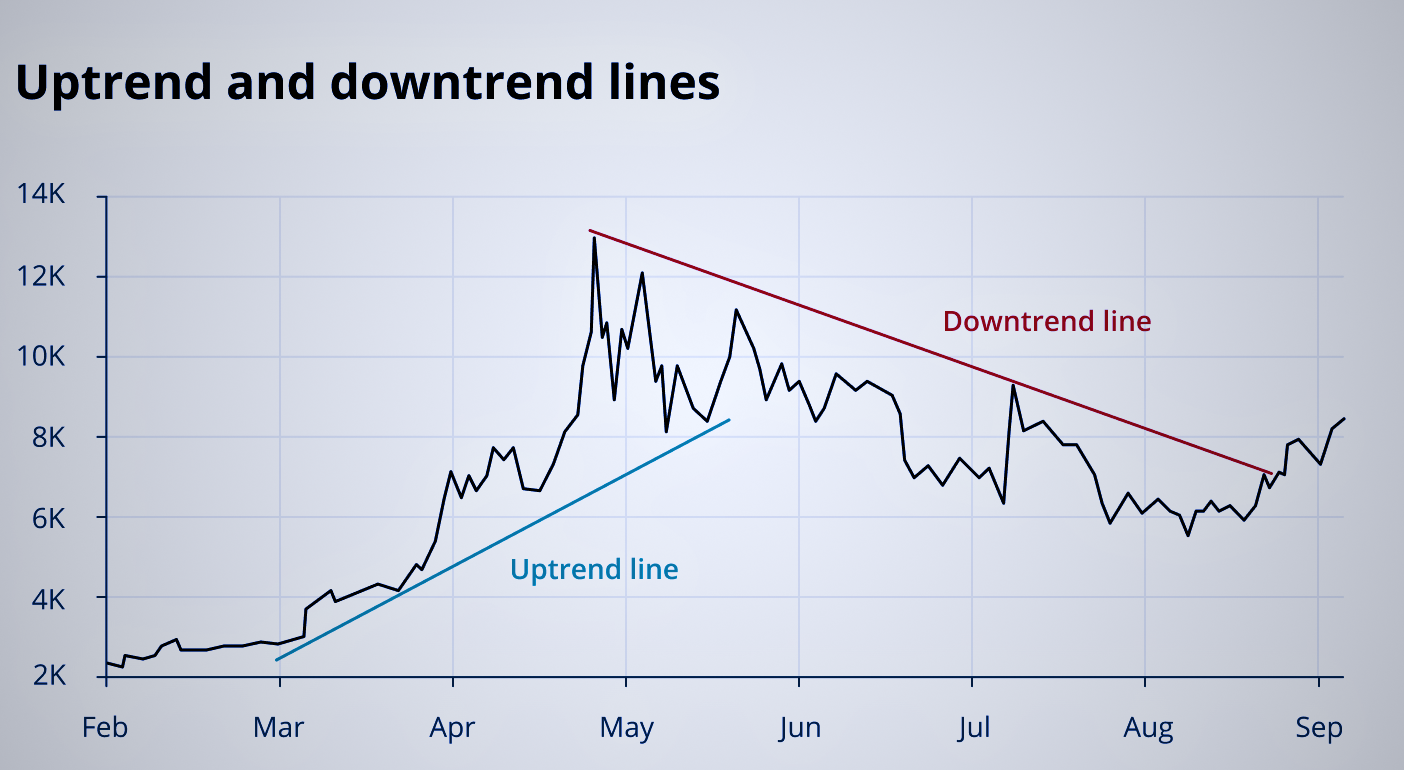
Trendlines are straight lines drawn on a chart that connect specific points of a market trend, such as a series of support or resistance levels. They are used to highlight the direction of the market—whether it’s trending upward, downward, or moving sideways.
-
Ascending Trendlines
An ascending trendline is created by connecting multiple support levels in a market that is trending upward. Think of it as a line that connects the “lows” of the price movement, forming a kind of upward slope. Traders pay close attention to the support levels of an ascending trendline, as they indicate an area that helps prevent the price from dropping substantially lower.
-
Descending Trendlines
A descending trendline is created by connecting a series of declining peaks, forming a line that slopes downward. This line represents resistance in a downward-trending market, where traders are more likely to sell as the price approaches the trendline.
For example, if the price of a stock keeps dropping after touching a descending trendline, it indicates strong selling pressure at those levels. This can be useful for traders looking to exit a position or even take a short trade.

The strength of any trendline, whether ascending or descending, increases as it reoccurs over time. When the price consistently reacts to a trendline, it suggests that the trendline is a significant indicator of market sentiment. Traders often record these barriers to inform their ongoing trading strategy, as strong trendlines provide valuable insights into the direction and strength of a trend.
Trendlines can be used to identify entry and exit points based on the direction of the trend. If the market is in an uptrend and the price touches an ascending trendline, traders might look for buying opportunities. On the other hand, in a downtrend, traders might look for opportunities to sell when the price nears a descending trendline.
Trendlines can also help traders determine when a trend might be reversing. If the price breaks through an established trendline, it may indicate a shift in market sentiment and a potential reversal of the current trend.
Candlestick Chart Patterns
One of the most popular tools traders use to understand market sentiment is the candlestick chart. Candlestick charts show more information than simple line or bar charts, making them particularly useful for identifying potential price movements. Let’s break down the basics of candlestick patterns in simple terms.

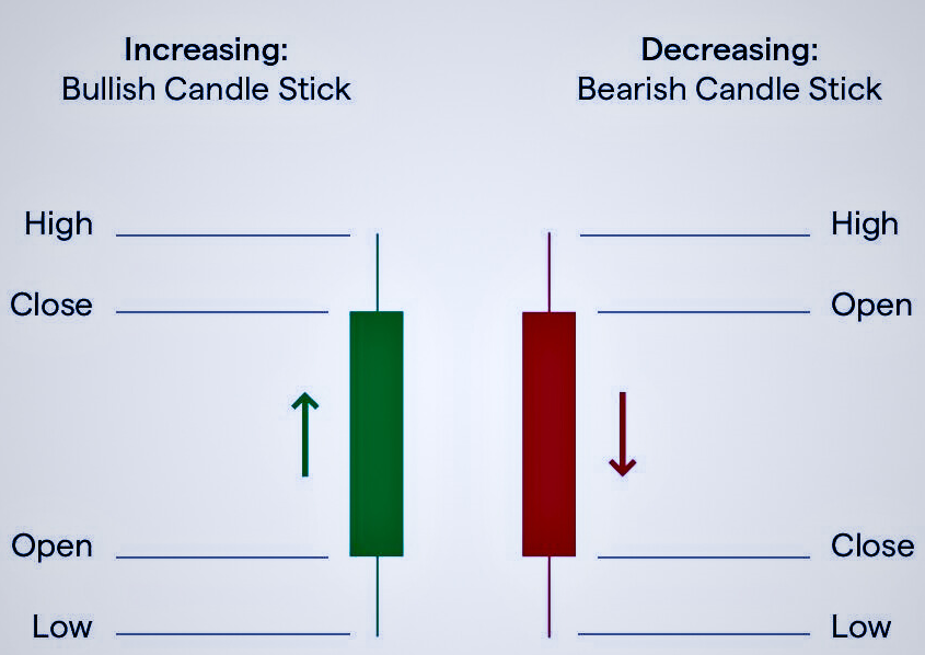
A candlestick chart represents the price movement of an asset during a specific period of time—whether that’s an hour, a day, or any other timeframe. Each candlestick on the chart shows four key price points:
Open: The price at which the asset started trading during that timeframe.
Close: The price at which the asset finished trading during that timeframe
High: The highest price reached during that timeframe.
Low: The lowest price reached during that timeframe.
How to read a candlestick
-
The Body
The thick part of the candle shows the opening and closing prices. If the closing price is higher than the opening price, the candle is usually green (or white), indicating that the price increased. If the closing price is lower than the opening price, the candle is typically red (or black), indicating that the price decreased.
-
The Wicks (or Shadows)
The thin lines above and below the body represent the highest and lowest prices during that timeframe. The top wick shows the highest price reached, while the bottom wick shows the lowest price.
Example
Imagine a candlestick representing a day of trading for a stock:
In this case, the body of the candlestick would show the opening price ($50) and closing price ($52), and the wicks would show the high ($55) and low ($48) of the day. Since the closing price ($52) is higher than the opening price ($50), the candle would be green, indicating a positive day.
Summary
Candlestick patterns are a powerful way to visualize price movements and understand market sentiment. By observing the body and wicks of each candlestick, traders can quickly gather information about the market’s behavior during a specific timeframe. Learning to read candlestick charts is an essential skill for any trader looking to make informed decisions based on price action.
